Karpo Tea Packaging Design
Logo Design/Packaging Design/Illustration
Personal Project, 2023
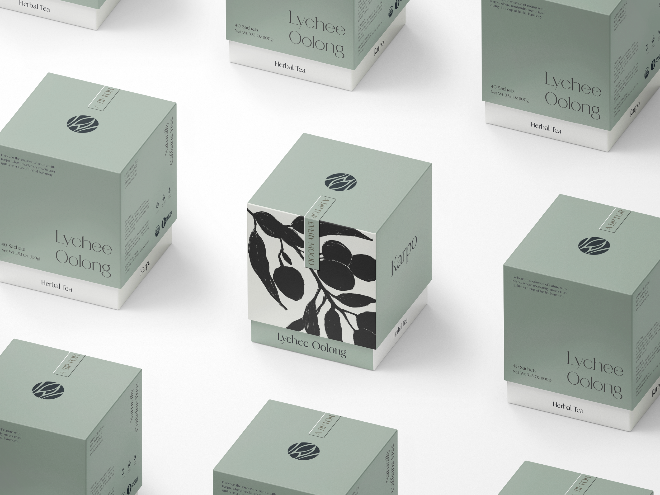
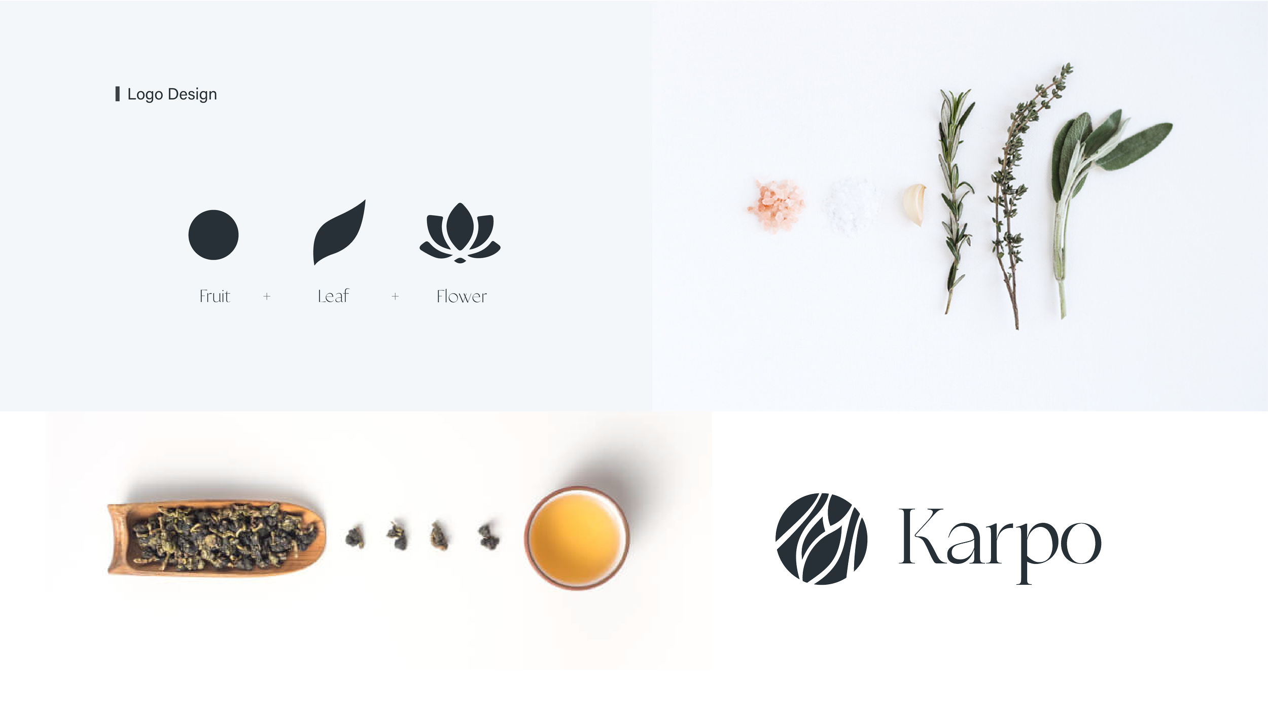
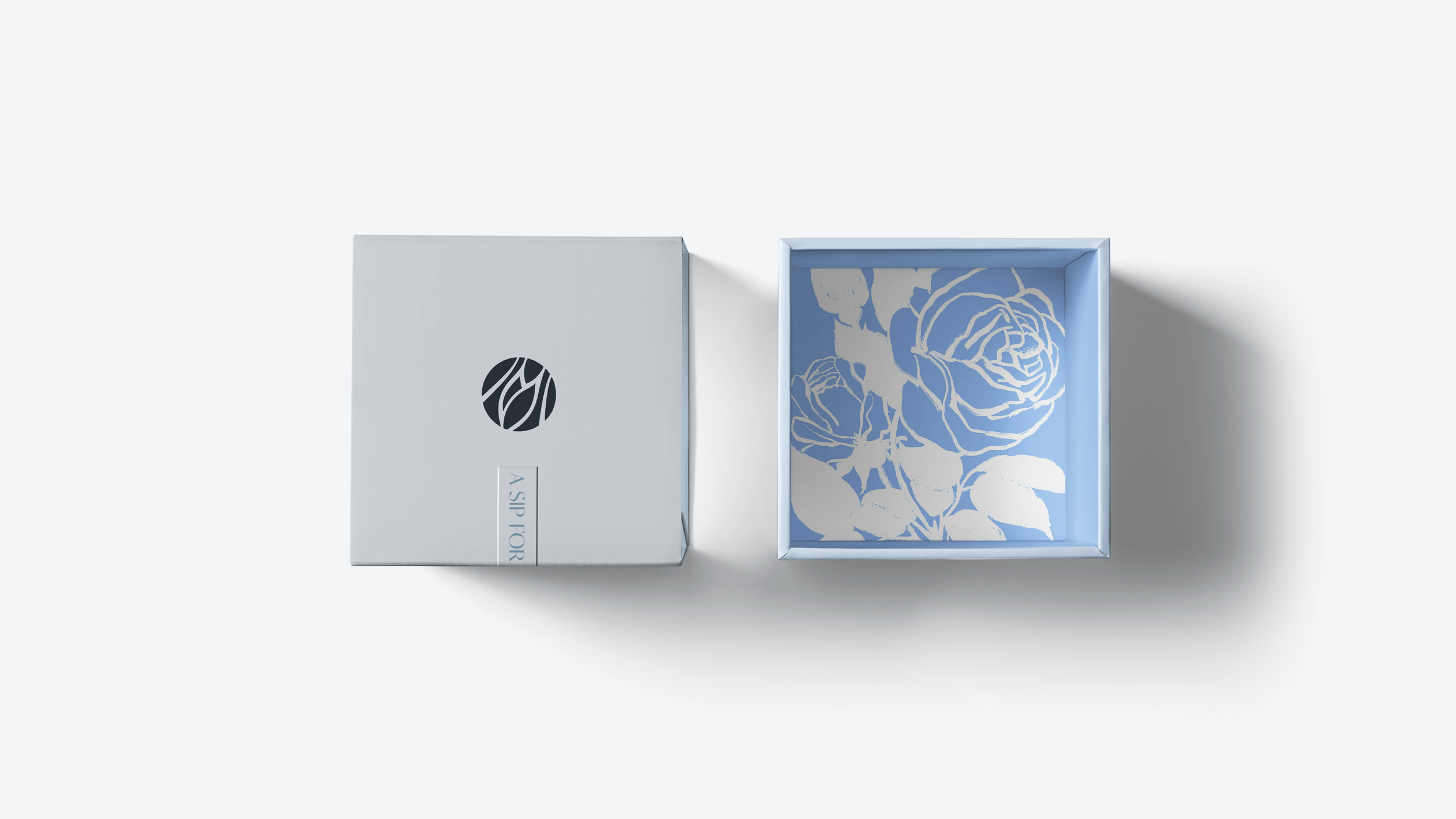
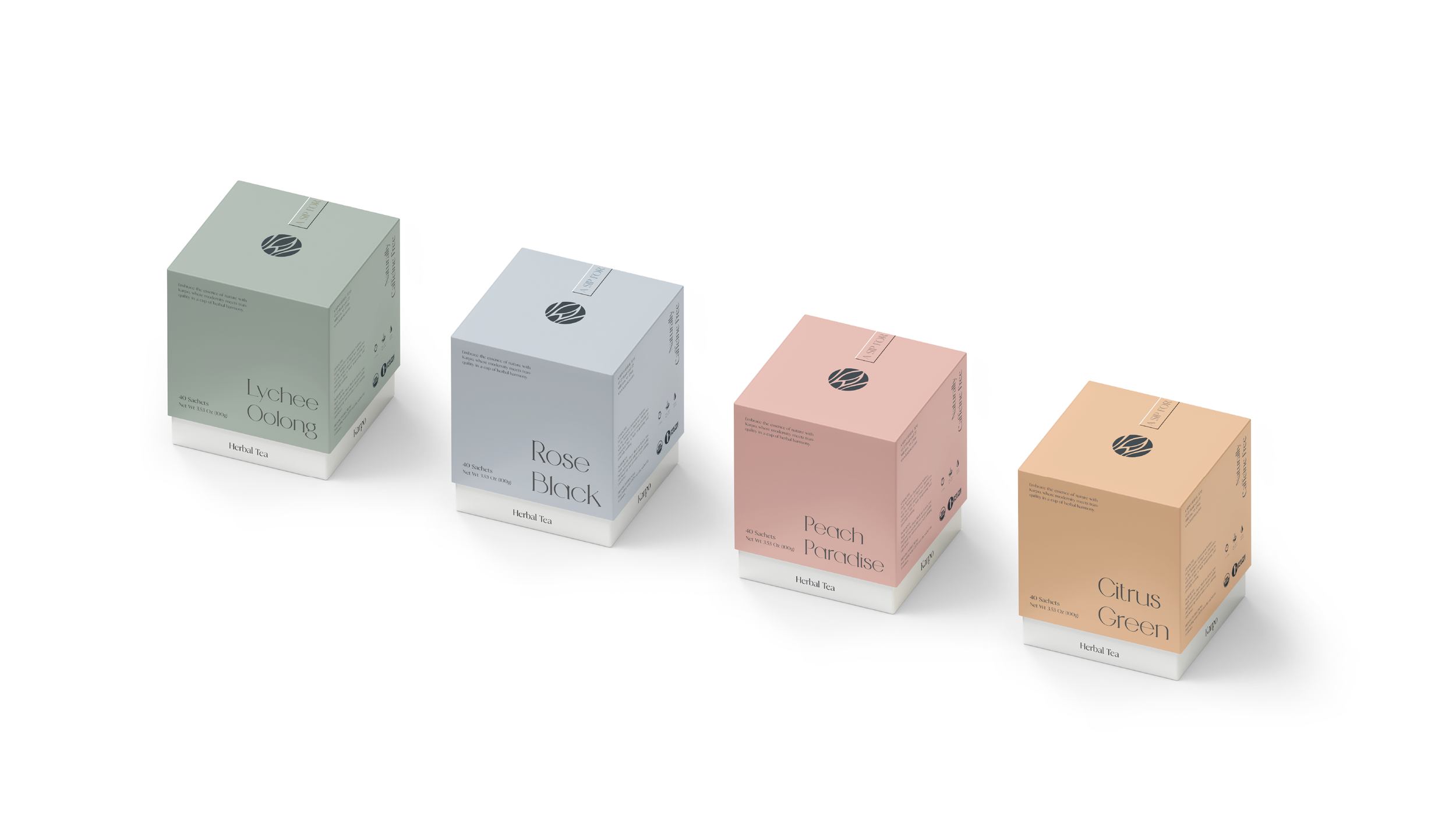
The name Karpo is inspired by Carpo, the Greek goddess of harvest and ripened fruit—an embodiment of nature’s moment of fulfillment. Rooted in this idea, the logo is built upon a distilled visual language derived from three essential botanical elements: fruit, leaf, and flower, representing different stages within a continuous cycle of growth.
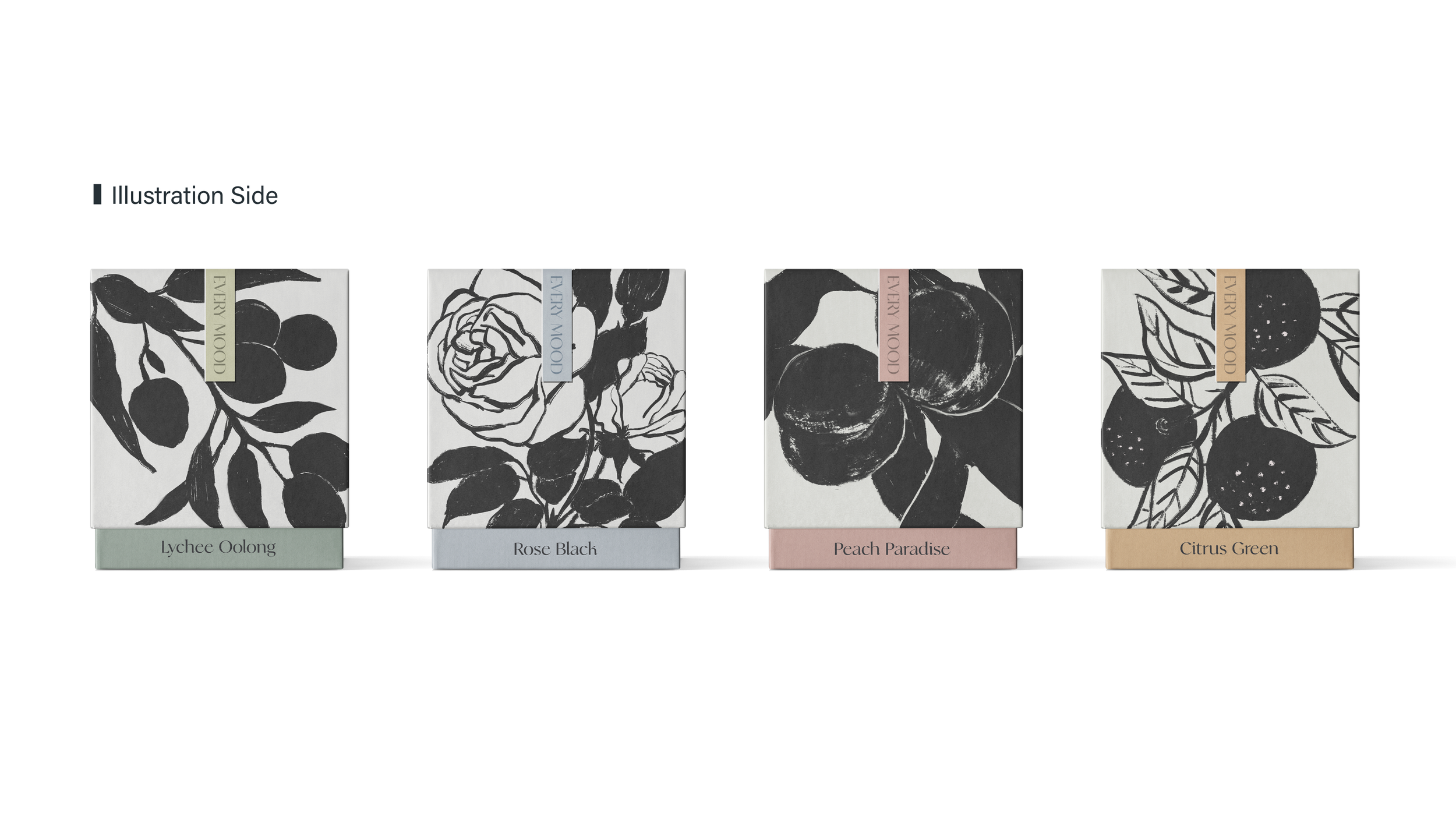
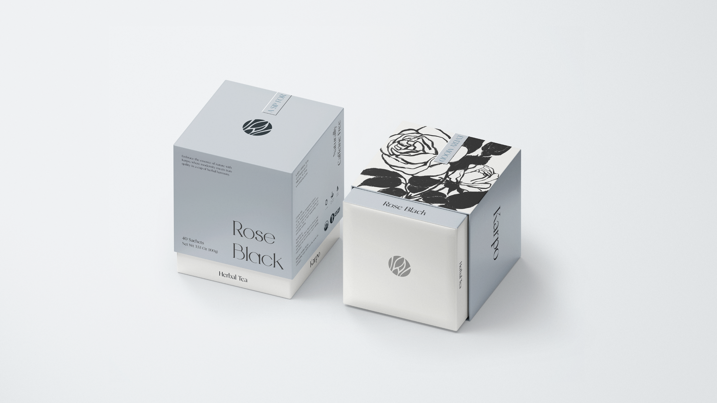
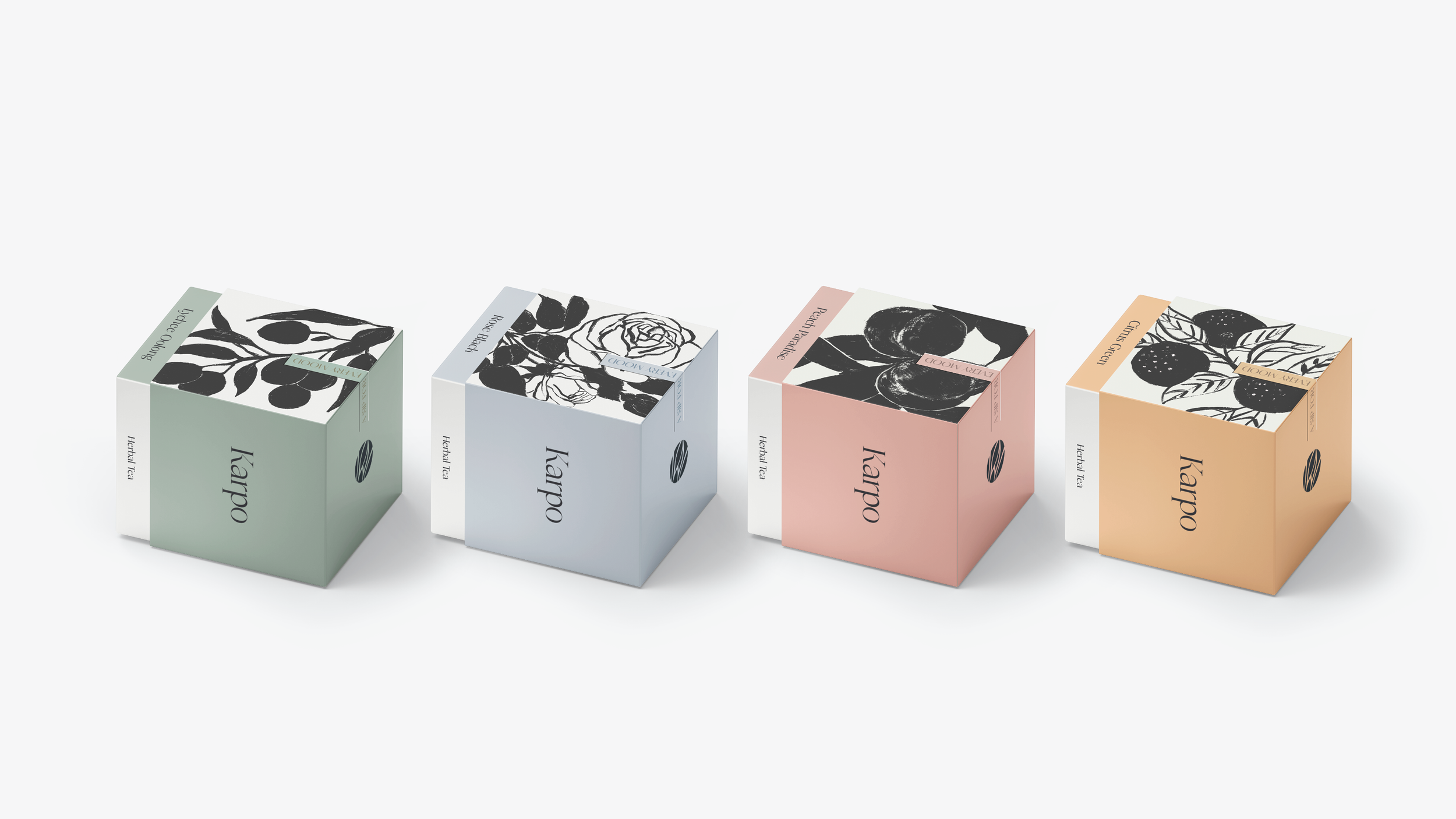
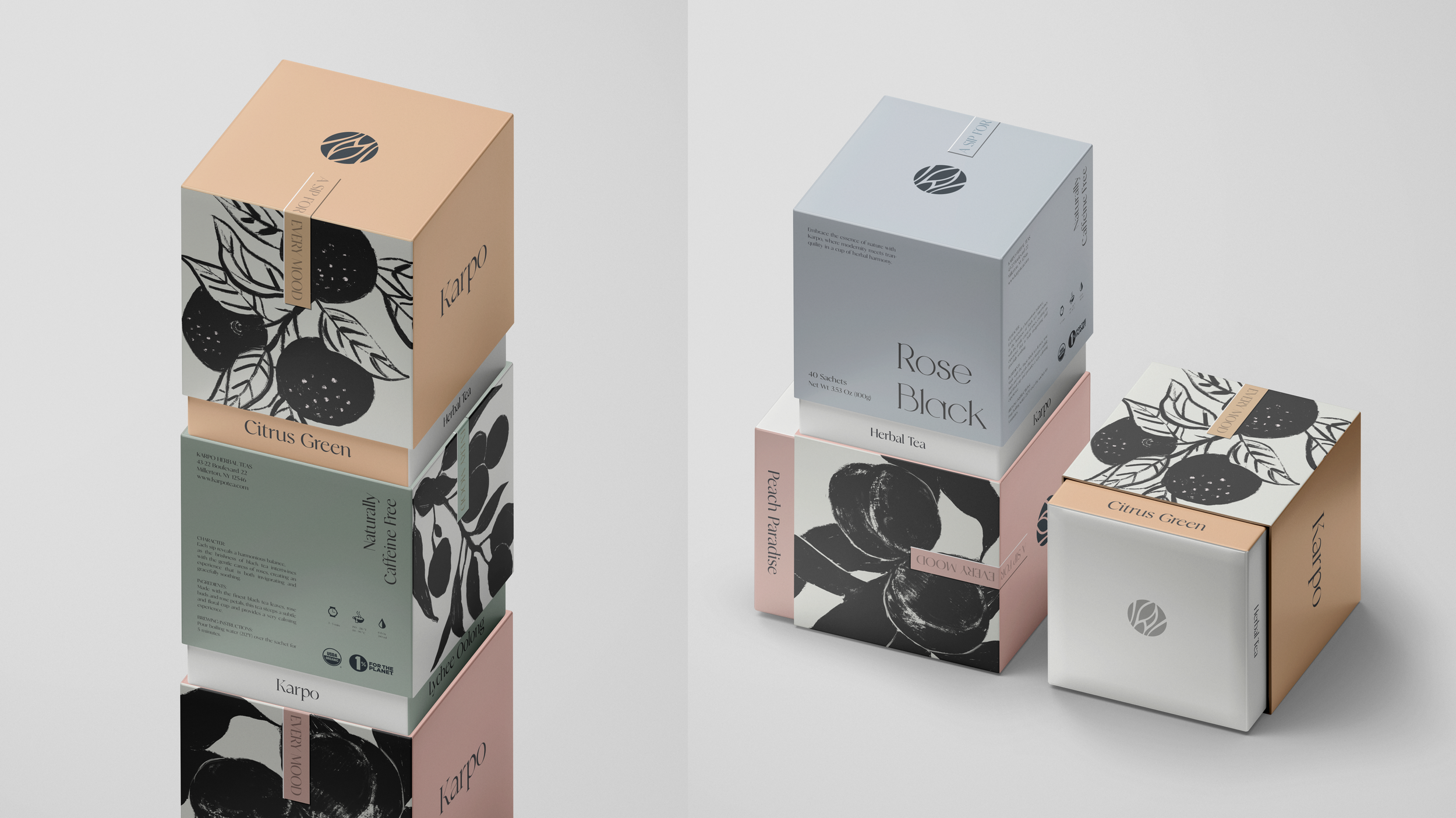
Extending from the logo, the illustration system translates this philosophy into a more expressive visual layer. Inspired by traditional Eastern botanical art, the illustrations adopt a restrained black-and-white approach, emphasizing form, contrast, and negative space over decorative detail.
This contrast between the minimal logo and the expressive illustrations creates a dynamic balance—where structure meets intuition, and tradition is reinterpreted through a contemporary lens.